
In this previous blog post, I wrote about the features of a powerful tool called Storybook, which can be used to aid and document the development of UI components using modern JavaScript libraries.
To demonstrate some of the features described in that blog post, I will provide an example of how to integrate Storybook into a basic React application. Together we will create a single React component, which will display basic information about a bank account, and we will use it to demonstrate some of the features of Storybook, explore the Storybook interface, and discover how we can use Storybook to test our component.
Setup the application
We will begin by using Create React App to setup our basic React application, and then install Storybook and two extra libraries - Emotion, which we will use to apply basic styles to our component, and react-currency-format, which we will use to apply some basic currency formatting.
Use the following commands to setup the application (named bank-storybook-demo) and install Storybook, Emotion and react-currency-format.
npx create-react-app bank-storybook-democd bank-storybook-demonpx -p @storybook/cli sb initnpm install @emotion/styled @emotion/corenpm install react-currency-format
Our basic React application is now installed in the bank-storybook-demo folder.
Create the component
In this example, we want the component to display an account name, some account details (an account number and a sort code), a current balance, and a list of transactions related to the account. These will be declared as props, which are used in React to allow data to be passed into a component. In addition, to make the component more visually attractive, styled components will be used to add some CSS styles to each section. The core account data will be placed on one row, and the list of transactions will be placed on another row below the first one.
In your application, add a new file named BankAccount.js in the src\components folder, and add the markup below to create the initial implementation of the component.
import React from "react";import styled from "@emotion/styled";import CurrencyFormat from "react-currency-format";import Transactions from "./Transactions";const Container = styled.div`align-items: center;border: solid 1px #ccc;border-left: solid 10px hotpink;display: flex;flex-direction: column;justify-content: space-between;font-family: Arial;padding: 10px 20px;width: 600px;`;const Row = styled.div`align-items: center;display: flex;flex-direction: row;justify-content: space-between;width: 100%;`;const AccountDetails = styled.div`font-size: 0.75rem;`;const CurrentBalance = styled.div`font-size: 1.2rem;font-weight: bold;`;const BankAccount = ({accountName,accountNumber,sortCode,currentBalance,transactions,}) => {return (<Container><Row><div data-testid="account-name">{accountName}</div><AccountDetails data-testid="account-details">{accountNumber} | {sortCode}</AccountDetails><CurrentBalance data-testid="current-balance"><CurrencyFormatvalue={currentBalance}displayType={"text"}thousandSeparator={true}prefix={"£"}decimalScale={2}fixedDecimalScale={true}/></CurrentBalance></Row><Row><Transactionstransactions={transactions}data-testid="transactions"/></Row></Container>);};export default BankAccount;
There are a number of references to data-testid which will be used later when we come to testing the component. You may also notice that the component makes reference to a separate component to display the list of transactions. This hasn't been created yet, so we need to do this. Again, basic styles will be added to this component using styled components. By having the list of transactions in a separate file, it makes the code more modular by keeping the logic to display the transactions separate from the logic to display the bank account.
Add a new file named Transactions.js in the src\components folder with the markup below.
import React from "react";import styled from "@emotion/styled";import CurrencyFormat from "react-currency-format";const Table = styled.table`width: 100%;font-size: 0.75rem;margin-top: 10px;`;const Date = styled.td`width: 100px;`;const Amount = styled.td`text-align: right;`;const Transactions = ({ transactions, ...rest }) => {return transactions ? (<Table {...rest}><tbody>{transactions.map((txn, idx) => (<tr key={idx}><Date>{txn.date}</Date><td>{txn.description}</td><Amount><CurrencyFormatvalue={txn.amount}displayType={"text"}thousandSeparator={true}prefix={"£"}decimalScale={2}fixedDecimalScale={true}/></Amount></tr>))}</tbody></Table>) : null;};export default Transactions;
Add logic to support variations
With our basic bank account component implemented, let's add some logic to support three different variations. These variations allow our component to be more flexible when used in an application, and will form the basis of the three use cases, or stories, which will be documented by Storybook.
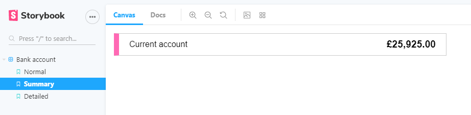
- Summary variation
- Displays account name and current balance only
- Normal variation
- Displays account name, account number, sort code, and current balance
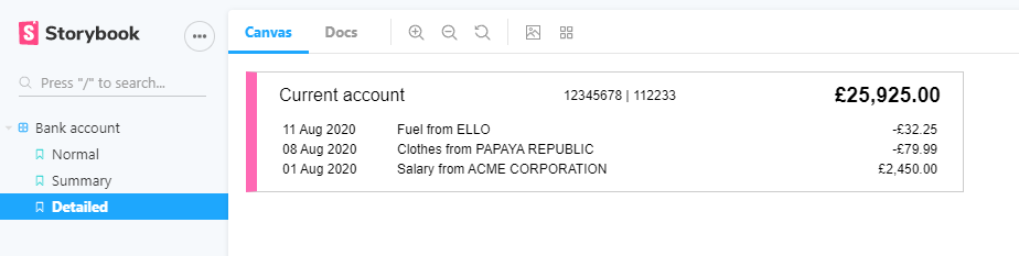
- Detailed variation
- Displays account name, account number, sort code, current balance, and a list of recent transactions
In order to implement these, a new variation prop needs to be added to the component to support these three stories, along with the logic to determine which parts of the component will be displayed based on which variation has been selected. To do this, update your bank account component with the following changes.
transactions,variation,}) => {const showAccountDetails = variation === "NORMAL" || variation === "DETAILED";const showTransactions = variation === "DETAILED";return (
<div>{accountName}</div>{showAccountDetails && (<AccountDetails>{accountNumber} | {sortCode}</AccountDetails>)}<CurrentBalance>
</Row>{showTransactions && (<Row><Transactions transactions={transactions} /></Row>)}</Container>
This new logic ensures that the account details are only shown if the variation is "NORMAL" or "DETAILED", and the list of transactions is only shown if the variation is "DETAILED".
Document the component
Now our component has suitable logic to respond to the three variations. Before we take a look at how it looks in Storybook, some typechecking needs to be added to our component, which Storybook will extract and display in the documentation section to describe the data type of each of the data items, along with some comments to describe what the data item should contain. To do this, it's time to install another library - prop-types. This library is used to ensure that the data being passed into a prop is valid by attaching a data type to each of the props.
npm install prop-types
A comment block needs to be added above the component definition to describe what the component is, prop types need to be defined below the component definition, and then further comment blocks needs to be added to each prop type to describe what each prop is used for. The prop types will be used by the Controls feature of Storybook to support interactive experimentation of the component. Below the prop types, some default props, which will be used by the component if any of the optional props are not supplied, also need to be defined.
Update your bank account component with the changes below.
import styled from "@emotion/styled";import PropTypes from "prop-types";import CurrencyFormat from "react-currency-format";
font-weight: bold;`;/*** This is a component to display information about a bank account.*/const BankAccount = ({
</Container>);};BankAccount.propTypes = {/**The name of the account*/accountName: PropTypes.string.isRequired,/**The account number of the account*/accountNumber: PropTypes.string.isRequired,/**The sort code of the account*/sortCode: PropTypes.string.isRequired,/**The current balance of the account*/currentBalance: PropTypes.number.isRequired,/**A list of transactions for the account*/transactions: PropTypes.arrayOf(PropTypes.shape({date: PropTypes.string.isRequired,description: PropTypes.string.isRequired,amount: PropTypes.number.isRequired,})),/**The variation of this component to control how much data should be displayed*/variation: PropTypes.string,};
BankAccount.defaultProps = {accountName: "",accountNumber: "",sortCode: "",currentBalance: 0,transactions: [],variation: "NORMAL",};export default BankAccount;
Our bank account component is now looking in good shape. It includes the logic to handle our three different variations, it includes prop types to define the data type for each of the props, and it includes comment blocks which describe what the component does and what each data should be passed into each prop. It even looks quite smart too. 😁
Create the stories
In order to make Storybook aware of the use cases that our bank account component supports, some stories need to be written about our component.
Add a new file named BankAccount.stories.js in the same src\components folder with the script below.
import React from "react";import BankAccount from "./BankAccount";export default {component: BankAccount,title: "Bank account",};const Template = (args) => <BankAccount {...args} />;export const Normal = Template.bind({});Normal.args = {accountName: "Current account",currentBalance: 25925,accountNumber: "12345678",sortCode: "112233",transactions: [{ date: "11 Aug 2020", description: "Fuel from ELLO", amount: -32.25 },{date: "08 Aug 2020",description: "Clothes from PAPAYA REPUBLIC",amount: -79.99,},{date: "01 Aug 2020",description: "Salary from ACME CORPORATION",amount: 2450,},],};export const Summary = Template.bind({});Summary.args = {...Normal.args,variation: "SUMMARY",};export const Detailed = Template.bind({});Detailed.args = {...Normal.args,variation: "DETAILED",};
This defines the three stories which the component supports (Normal, Summary, and Detailed), and also defines some mock data to pass into the component for each of those stories.
Storybook allows users to update components in real time using automatically generated controls based on the data type of each prop that the component supports. For example, our component accepts an account name (accountName) as a string data type, so Storybook will render a plain textbox to allow the account name to be edited. As we know that the variation has three fixed options from which the user can select, some code should be added to tell Storybook that the variation should be displayed as a series of radio buttons with three options. This is done not just to improve the user experience, but also to add a layer of validation to ensure that the user can only set the variation to a valid value.
Update the stories file with the addition of the argTypes property.
title: "Bank account",argTypes: {variation: {control: {type: "inline-radio",options: ["NORMAL", "SUMMARY", "DETAILED"],},},},};const Template = (args) => <BankAccount {...args} />;
Finally, some changes need to be made to the Storybook configuration, so that it is aware of the stories we have added.
Update the main.js file in the .storybook folder to contain the following module.exports definition.
module.exports = {stories: ["../src/components/**/*.stories.js"],addons: ["@storybook/preset-create-react-app","@storybook/addon-links","@storybook/addon-essentials",],};
This ensures that Storybook can locate the stories file we created earlier in the src\components folder.
Run Storybook
With the component and the stories now complete, it's time to take a look at our bank account component in Storybook. To do this, run using the following command.
npm run storybook
This will start the Storybook server and display our bank account component in the browser.
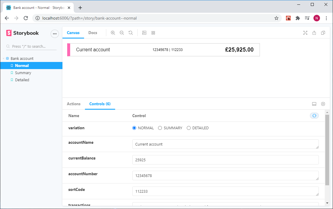
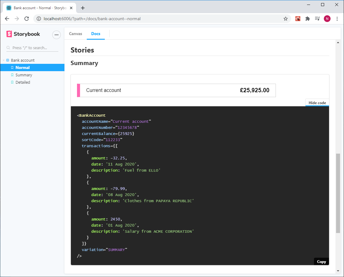
By default, Storybook displays the first story which was defined in the BankAccount.stories.js file, and this happens to be the one which uses the normal variation. You'll see all of the stories listed in the left navigation, and if you select the other two stories, Storybook will update to display the component with that variation applied.
Above the component, you'll see some icons which represent various options. This includes options to change the colour of the background and change the size of the viewport to see how the component responds at different sizes. There's also a "Docs" option, which reveals documentation about the component, along with the same interactive controls to allow the user to experiment with the component.
Select the "Docs" option, and you'll see the metadata that we added to the component earlier.
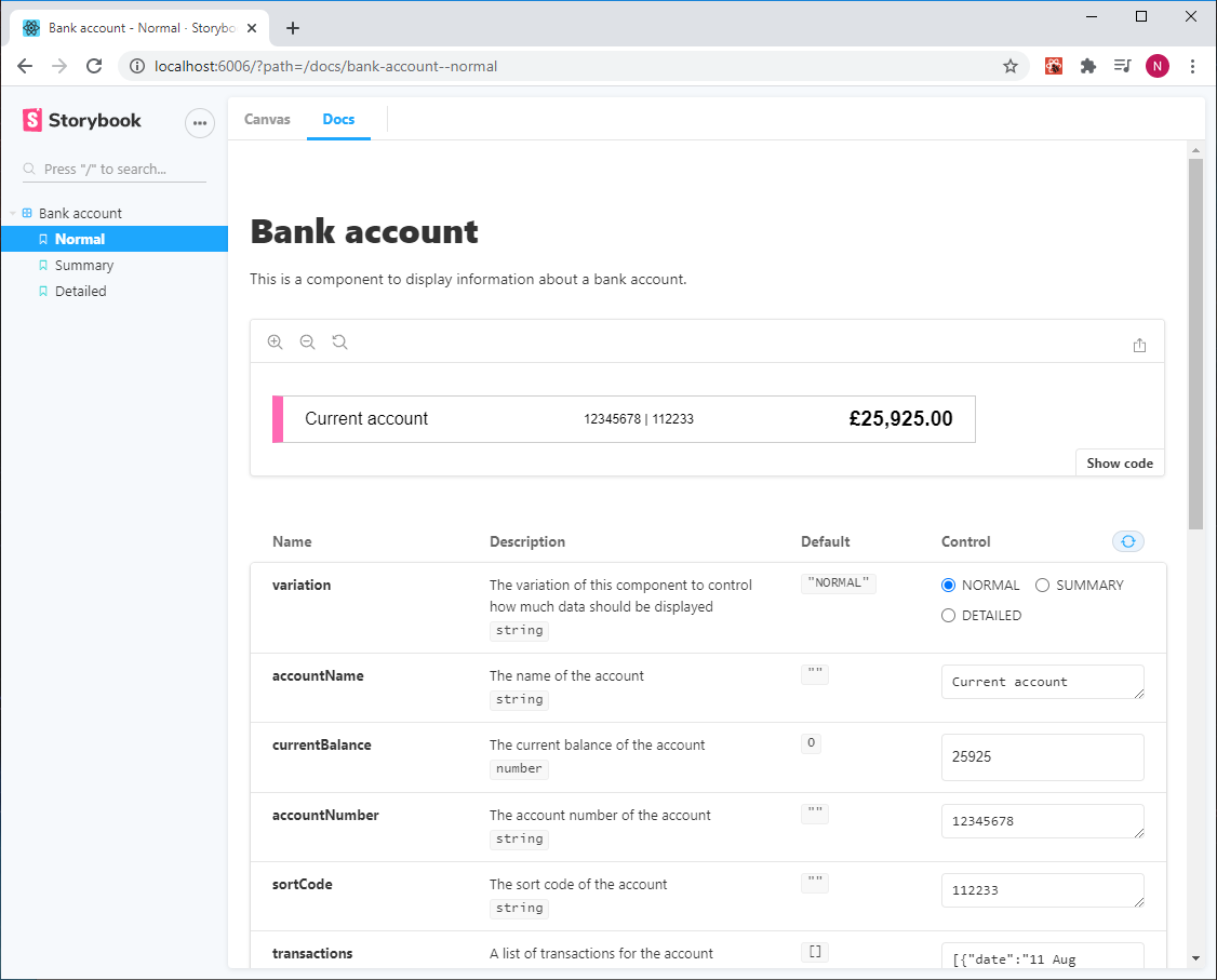
Select the "Show Code" option, and you'll see a snippet of code, which is the exact piece of React used to render that component.
Add testing to the application
Storybook supports a number of testing options, each of which test a component in different ways for different purposes. The benefits of the different testing approaches are widely documented, but in this example, we will add some basic unit tests, automated visual tests, and snapshot tests.
Unit testing
Unit testing allows us to check that a component in isolation works as expected. Let's write some basic unit tests to check that the data for each of the variations displays as expected. This code will search for specific parts of the component (using the attribute data-testid which we added earlier when building the component) and check whether that section is displayed, or not displayed, for that particular variation.
Any application created using Create React App comes with React Testing Library to support testing of components, so we use this to write the tests. This uses Jest as the underlying testing framework, so if you are already familiar with this, writing these tests will be a familiar concept to you.
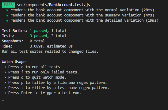
Add a new file named BankAccount.test.js in the same src\components folder with the following unit tests for each variation.
import React from "react";import { render, screen } from "@testing-library/react";import "@testing-library/jest-dom/extend-expect";import { Normal, Summary, Detailed } from "./BankAccount.stories";test("renders the bank account component with the normal variation", async () => {render(<Normal {...Normal.args} />);expect(screen.queryByTestId("account-name")).toBeInTheDocument();expect(screen.queryByTestId("account-details")).toBeInTheDocument();expect(screen.queryByTestId("current-balance")).toBeInTheDocument();expect(screen.queryByTestId("transactions")).not.toBeInTheDocument();});test("renders the bank account component with the summary variation", async () => {render(<Summary {...Summary.args} />);expect(screen.queryByTestId("account-name")).toBeInTheDocument();expect(screen.queryByTestId("account-details")).not.toBeInTheDocument();expect(screen.queryByTestId("current-balance")).toBeInTheDocument();expect(screen.queryByTestId("transactions")).not.toBeInTheDocument();});test("renders the bank account component with the detailed variation", async () => {render(<Detailed {...Detailed.args} />);expect(screen.queryByTestId("account-name")).toBeInTheDocument();expect(screen.queryByTestId("account-details")).toBeInTheDocument();expect(screen.queryByTestId("current-balance")).toBeInTheDocument();expect(screen.queryByTestId("transactions")).toBeInTheDocument();});
These unit tests will render the component for each of the stories defined in the stories file, search for specific elements within the component (using the screen.queryByTestId function), and validate whether or not that element should be present.
Run these unit tests using a simple command.
npm run test
The results of these tests should be displayed in the console window. If all goes well, all of the tests should pass.
Visual testing
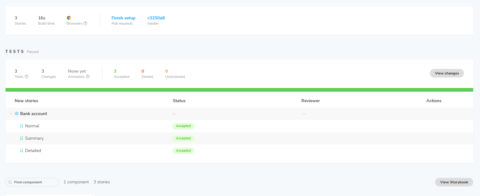
Visual testing allows us to check that a component displays as expected by reporting on any differences between a previous visual of the component and the current visual. Storybook uses Chromatic, a visual testing service which identifies changes in a component based on its appearance and supports a workflow to review and accept those changes. Chromatic has various pricing plans, but the free tier offers all core features and a generous 5,000 snapshots per month. Once the code is in a repository (GitHub/GitLab/Bitbucket), you need to follow the instructions on Chromatic to grant access to that repository.
Once linked, Chromatic will analyse the stories in the project, render the component for each of those stories, and store a visual of what each component looks for each of those stories. This acts as the baseline.
Once a baseline has been generated, Chromatic should report on any visual changes made to that component. Let's change the colour of the left border and the font size of the current balance.
Update the bank account component with the following CSS changes.
const Container = styled.div`align-items: center;border: solid 1px #ccc;border-left: solid 10px blue;display: flex;flex-direction: column;justify-content: space-between;font-family: Arial;padding: 10px 20px;width: 600px;`;
The project can now be republished to Chromatic from the command line.
To do this, run the following command (note that the token for this project has been obfuscated, but if you've linked your repository to Chromatic, you will have your own token).
npx chromatic --project-token=u********j
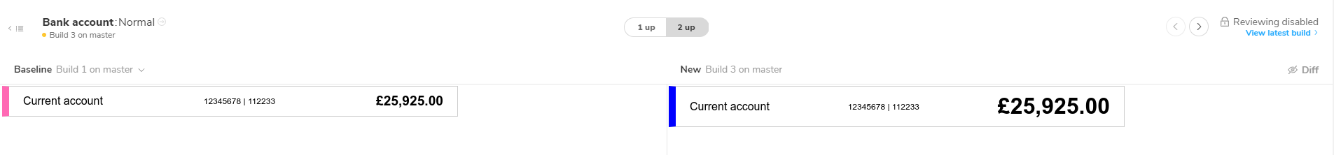
Once this has been done, viewing the project in Chromatic reveals that each story has changes which need to be reviewed.
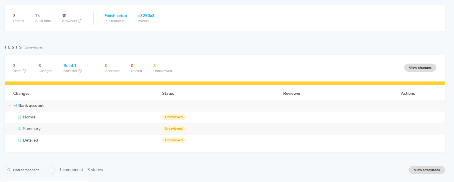
From here, we can examine the exact differences side-by-side. A "diff" icon is provided which will mark all differences in green, but the differences we have made are easy to spot - the left border is now blue and the current balance is much larger.
The process can be made much more efficient by configuring continuous integration to publish the project to Chromatic whenever code is pushed to the repository. This would remove the need for the manual command line approach to publish the project each time changes are made.
Snapshot testing
Snapshot testing allows us to check that the HTML generated by a component matches the HTML previously generated by the component. The initial snapshot of HTML acts as a baseline, and all further tests are compared with that baseline to identify any differences. If these differences are intentional, a new snapshot needs to be generated to act as the new baseline; if these differences are not intentional, they need to be resolved before another snapshot test is executed. It's a very effective way to detect changes in components.
A snapshot test will be added for our component to make sure that any changes to the HTML are reported. First, we need to add another couple of libraries to our project to do this. Storybook recommend using Storyshots (and react-test-renderer) to run snapshot testing for components, so these will be added now.
To add these libraries, run the following commands.
npm install @storybook/addons-storyshotsnpm install react-test-renderer
Next, update the test file to include the script to take the snapshots.
import "@testing-library/jest-dom/extend-expect"import initStoryshots from "@storybook/addon-storyshots"import { Normal, Summary, Detailed } from "./BankAccount.stories"initStoryshots();test("renders the bank account component with the normal variation", async () => {
Finally, run the same command as we used for the unit tests above.
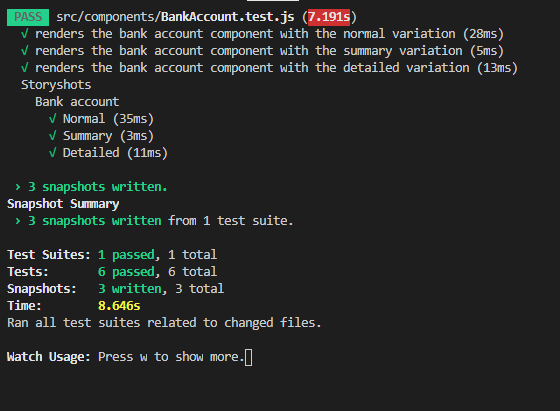
npm run test
Along with running the unit tests, this should display confirmation that three snapshots were taken.
After the snapshot test has been run, a single snapshot file named BankAccount.test.js.snap is created in a new src\components\__snapshots__ folder. This file contains the HTML of the component for each of the three stories and acts as the baseline from which all future snapshot tests are compared. A typical snapshot for a story displays the name of the component, the name of the story, and the HTML generated by the component, using the mock data supplied in the story.
exports[`Storyshots Bank account Summary 1`] = `<div className="css-yei9ms"><div className="css-1f15hg"><div data-testid="account-name">Current account</div><div className="css-ii42vf" data-testid="current-balance"><span>£25,925.00</span></div></div></div>`;
If the next run of the snapshot test reveals any changes between the snapshot and the HTML generated by the latest version of the component, the failed tests will be reported in the console window to allow corrective action to be taken.
That wraps up our bank account component, developed and tested using Storybook. You can fetch the code used in this example from GitHub. In addition, as we linked our repository to Chromatic, the storybook we have built is also available at Chromatic.
I hope you found this guide useful. If you have any comments about Storybook, please get in touch and let me know, or leave a comment below to start the discussion.