The world of front-end web development has evolved a great deal since the early days of Web 1.0 and it continues to evolve faster than ever. In recent times, the tide has largely turned towards modern JavaScript libraries such as React, Angular, and Vue, which favour the development of applications through the composition of small modules or components in combination with APIs to provide the data to power those front-ends.
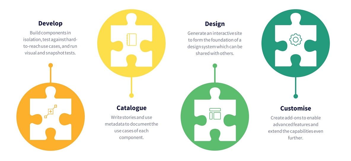
As far as JavaScript development is concerned, developers can turn to public repositories such as npm or Yarn to find components which have already been created to serve a particular purpose, rather than writing components from scratch. Whether it is as simple as a date picker, or as complex as a set of UI controls which follow a consistent design system, there's a component for most needs. If there isn't, developers can create their own component libraries, which can be kept in private repositories or shared in the same public repositories mentioned above. This practice of creating components first and assembling them together as larger components or pages is the fundamental concept of component-driven development. It means that developers can build components in isolation without being distracted by the wider context of the page which consumes those components. A component which has been integrated into a page can be only tested using the scenarios that the page supports, whereas testing a component in isolation allows the developer to test all of the scenarios that the component supports. Having a tool to support the development and testing of components is essential, but having a tool which also acts as a catalogue of those components, a repository of component documentation, a sandbox which allows users to experiment with those components, and a testing framework to test those components, is a game-changer for modern component development. This is the story of Storybook.
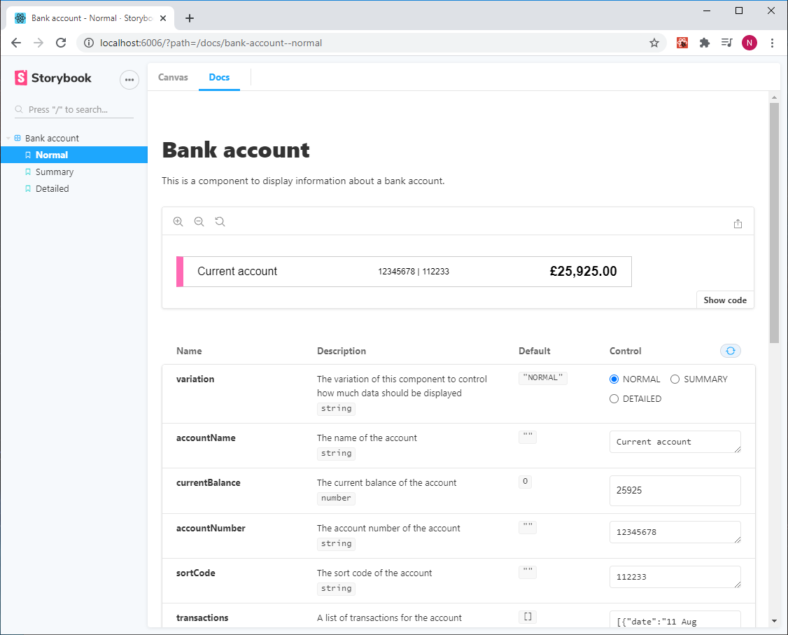
Storybook is a powerful tool which can be integrated into any React, Angular, or Vue application or standalone component library. As well as being a catalogue of components, it provides a sandbox to allow components to be developed and tested in isolation across the entire range of use cases (or "stories", in Storybook parlance) which those components support. Alongside those stories, Storybook displays documentation about each component in a way that makes it easy to see and understand what a component does. This documentation is generated automatically using metadata within each component, which removes the need to maintain a separate repository of documentation. The composition of the documentation is highly flexible, and further customisation options are available to allow more advanced control over the presentation of the documentation if it is needed.
In the last major release, a new feature called Controls was added which enables a user to interact with a component by changing the data being passed into it using some interactive controls generated automatically by Storybook. This is very powerful, as it allows users (including those without a technical background) to experiment with the appearance and behaviour of a component in isolation before it is integrated into an application.
Another feature of Storybook is support for unit tests, which can be written to ensure that the component works as expected for each of the stories it supports. Traditionally, this would be harder to do if the component was being developed directly into the page of an application. In addition to unit testing, Storybook provides tools to support visual testing (has the component changed visually?), snapshot testing (has the markup generated by the component changed?) and interaction testing (does the component respond as expected in response to user interaction?). Storybook offers several options around testing of components, all of which help to improve test coverage and ensure that components are stable, robust, and function as intended.
By having a platform which documents components, what they look like, and how they function, Storybook provides the basis of a design system, which are becoming more popular in modern organisations. Design systems are typically used by developers and designers, and they help to define a single source of truth about what front-end components are available in an organisation, and what brand identity and design patterns should be followed when using those components. They provide clear guidance to developers and designers about how to use those components in a manner consistent with the message that the organisation aims to project to the outside world. Many organisations, particularly those whose components are used by developers outside of their organisation, have published their design systems - Atlassian, Microsoft, and Shopify are great examples of these. Storybook helps to promote design systems and even provides a specific tutorial about how to build design systems with Storybook.
When building a set of JavaScript components, Storybook has plenty of features to offer, with extensibility at the core of the system. It has comprehensive documentation, it is open-source with a community of over 1,000 contributors, it has nearly 6 million downloads per month, and its more high-profile users include Airbnb, Shopify, Lonely Planet, and the BBC. Not only does Storybook help with the development and testing of components, it also helps with documenting those components in an interactive, transparent, and easy-to-understand manner.
There is much more to discover about Storybook than the topics covered in this post, but this post should give a taster of the basic ethos that Storybook tries to promote - to help developers lay the foundations for modern, modular, and maintainable component libraries. In my next blog post, we'll build a simple React component and integrate it with Storybook, in order to see what that component looks like in Storybook and explore some of the features described in this post.